There ecommerce product sheet It's one of the most important pages in an online store. It's the point where users stop browsing generically and begin to consider purchasing.
For this reason, it can't be treated as a simple descriptive page. An effective product sheet must inform, reassure, and guide the user towards a clear decision. It must explain the product, highlight its benefits, eliminate doubts, and make the purchase process simple.
In a well-designed e-commerce, the product page is the meeting point between UX design, copywriting, SEO and conversion rate optimization. When these elements work together, the product page becomes a concrete tool for increasing sales, trust, and the quality of the user experience.
What is an ecommerce product page?
A product sheet It's the page dedicated to a single item within an e-commerce site. It contains all the information needed to help the user understand what they're purchasing, what features the product has, how they can use it, and why they should choose it.
It typically includes the title, images, price, description, specifications, variants, availability, reviews, shipping and return information, and a call to action to add the product to your cart.
Its role, however, is not merely informative. A product page must guide the user through the most delicate phase of the purchasing journey: the one where they evaluate the value of the offer and decide whether to trust the store.
A well-crafted product description doesn't just say "this is the product." It must answer the most important question: "why is this product right for me?".
Why the product sheet is crucial for conversions
Many ecommerce invest in campaigns Google Ads, social media, SEO and traffic acquisition activities, but then they neglect the very page that should transform that traffic into revenue.
This is a strategic mistake. Bringing users to the site is only part of the job. If the product description is unclear, slow, incomplete, or unconvincing, users may abandon the page even if they were genuinely interested.
An effective product page must reduce uncertainty. Users must quickly understand whether the product meets their needs, whether the price is justified, whether the site is trustworthy, and what happens after they click "Buy.".
In modern e-commerce, trust is a key driver. DigiFe works precisely on this approach: designing websites and e-commerce sites not as simple shop windows, but as tools capable of generating real business opportunities, combining design, data, technology, and conversion.
The fundamental elements of an effective product sheet
An effective product page is born from a balance between content, visuals, user experience, and trust levers.
There's no point in filling the page with unnecessary information. Instead, create a clear path, where each element has a specific function: to attract attention, explain the value, answer questions, and facilitate the purchase.
The main elements to take care of are:
- product title;
- images and videos;
- benefit-oriented description;
- technical specifications;
- price and availability;
- CTA;
- reviews;
- information on shipping, returns and assistance;
- SEO optimization;
- mobile usability.
Let's look at them in detail.
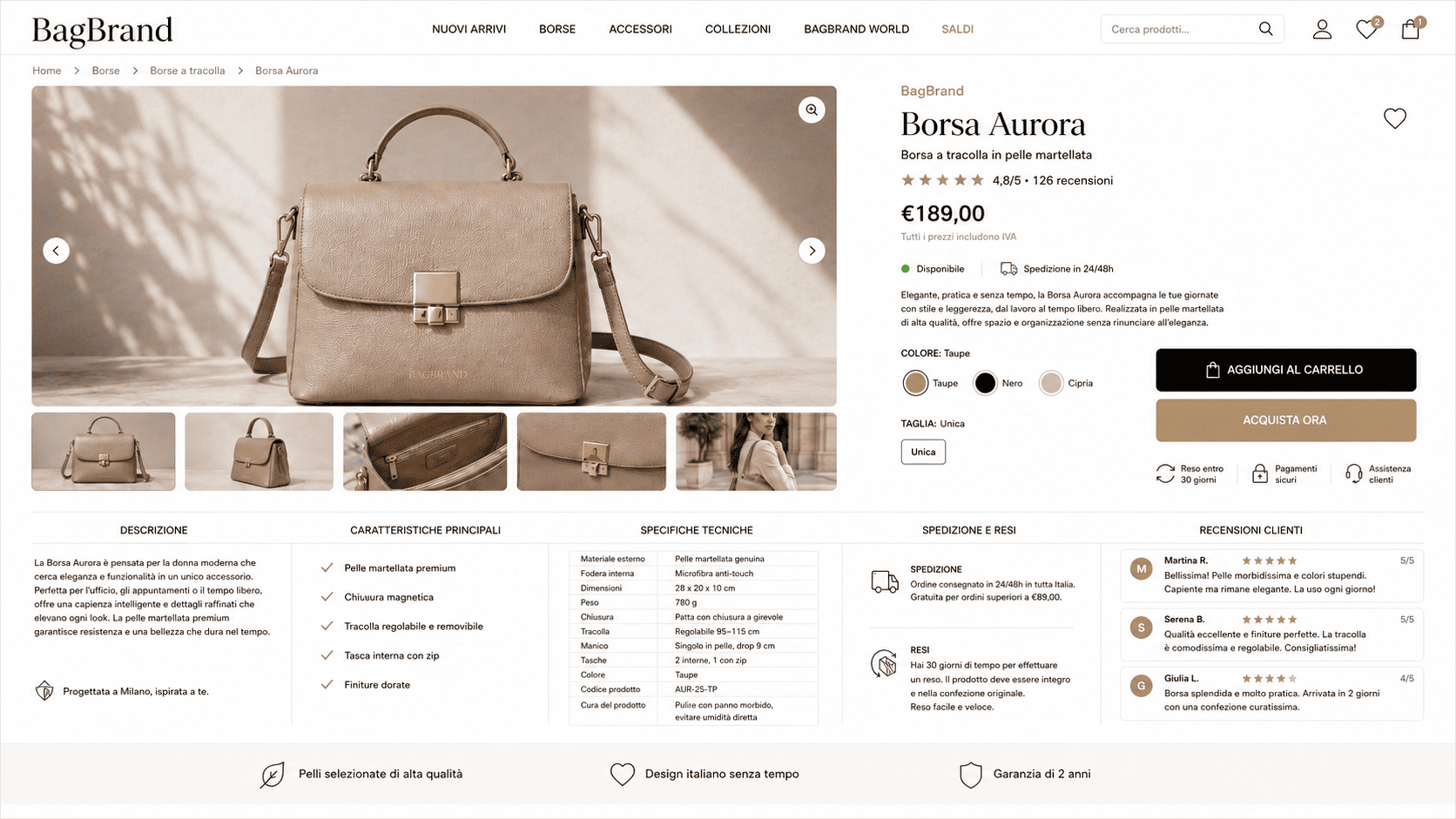
Product sheet title
The title is the first thing that helps users understand what they're looking at. It must be clear, specific, and consistent with how the product is searched for.
A generic title like "Wireless Headphones" doesn't convey much. A more comprehensive title, like "Wireless Bluetooth Noise Cancelling Headphones," helps both users and search engines quickly understand the page's content.
The title should describe the product without becoming artificial. It can include the brand, model, main feature, material, intended use, or distinctive benefit, but must remain legible.
From an SEO perspective, the product page title is often linked to the title tag and can influence how the page is perceived in search results.
Images and videos: the product must become concrete
In a physical store, the customer can touch, observe, and compare the product. This isn't the case online. This is why images and videos play a crucial role.
Images must show the product clearly, realistically, and comprehensively. A photo on a white background isn't enough. Users need to see details, proportions, variations, materials, and context of use.
An effective product description should include images from multiple angles, detailed photos, and ambient content. If the product allows, a short video can help demonstrate how it works, its actual dimensions, how to use it, or the final result.
The visual shouldn't just "beautify" the page. It should reduce the perceived risk and bring the user closer to making a decision.
Product Description: Fewer Features, More Value
The product description shouldn't be a copy of the supplier's technical data sheet. This is one of the most common mistakes in e-commerce.
A good description should explain the product in a useful way, connecting features and benefits. Users don't just want to read what the product contains, they want to understand why those features are important to them.
An effective description answers three questions:
- what is the product;
- to whom it is useful;
- what problem it solves or what need it satisfies.
For example, saying that a jacket is made of waterproof technical fabric is correct. But explaining that it protects from the rain without weighing you down, while maintaining comfort and freedom of movement, is much more helpful for those deciding whether to buy it.
Product description copy should be clear, concrete, and choice-driven. It shouldn't sound like forced advertising, but rather a well-crafted explanation that helps the user make an informed decision.
Technical specifications and practical information
Technical specifications are essential, especially for technological products, furniture, fashion, professional equipment, or items with measurable characteristics.
Dimensions, weight, materials, compatibility, power supply, composition, and instructions for use and maintenance must be easy to read. Users shouldn't have to search for this information on the page or, worse, ask support for it.
The best format is often a clear, organized table that's also readable on mobile devices. Specifications shouldn't interrupt the persuasive part of the page, but rather complement it.
A description tells the value. The technical data sheet confirms the details.
Call to action: the moment of decision
The call to action is the point where the user moves from evaluation to action. Therefore, it must be visible, clear, and immediate.
Text like "Add to Cart," "Buy Now," or "Order Now" works because it directly communicates what happens after the click. The CTA shouldn't be ambiguous, hidden, or confused with other elements on the page.
On mobile, the button should be easy to reach and click. In many e-commerce sites, a sticky CTA can be useful, always visible as the user scrolls, especially when the page is long and contains a lot of information.
The CTA, however, does not work alone. It works best when everything that precedes it has already built
Trusted: images, description, reviews, shipping and return information.
Elements of reassurance: trust before purchasing
Before purchasing online, users look for safety signals. They want to know how much shipping costs, when they'll receive the product, whether they can return it, how customer service works, and whether the site is trustworthy.
This information shouldn't be hidden on secondary pages. It should be integrated into the product description in a clear and accessible way.
The most important elements are:
- shipping times and costs;
- product availability;
- return policy;
- payment methods;
- customer support;
- guarantees;
- certifications or security elements.
This content reduces uncertainty and improves decision-making quality. In many cases, a product page doesn't convert not because the product isn't interesting, but because the user doesn't find enough reassurance to complete the purchase.
Reviews and social proof
Reviews are one of the most powerful elements on a product page, because they transfer some of the trust from the brand to other customers.
Users tend to trust more when they see that other people have already purchased, used, and rated the product. Reviews help confirm the quality of the item, address specific concerns, and make the sales promise more credible.
The most helpful reviews aren't just the ones with star ratings. They're the ones that contain
Real details: photos, product reviews, size information, delivery times, perceived quality, and actual use.
For this reason, whenever possible, it is useful to encourage complete reviews and not simply show an average rating.
SEO for e-commerce product pages
A product page must also be designed to attract qualified traffic from Google. Those searching for a specific product are often already close to purchasing, so a well-optimized page can generate visits with high sales potential.
SEO optimization should start with the main keyword, but it shouldn't stop there. You need to work on the title tag, meta description, URL, H1, product description, image alt text, internal linking, and structured data.
Google says structured product data can help display additional information in search results, such as price, availability, reviews, and other details that help understand the product.
A good SEO product listing should therefore include unique content, comprehensive information, and markup consistent with what the user actually sees on the page.
The goal isn't just to get your rankings right. It's to attract qualified clicks and direct the user to a page that converts.
Mobile-first UX: Product details must work on smartphones
Much of the ecommerce experience happens on mobile. This means that the product page must be designed primarily for small screens, short attention spans, and quick interactions.
An effective mobile page must load quickly, display key information immediately, and make every action simple: choosing a variant, checking availability, reading reviews, adding to cart, or contacting support.
Mobile-first UX doesn't mean removing content, but rather organizing it better. Secondary information can be collected in expandable sections, while pricing, images, variants, and CTAs must always remain easy to access.
If the user has to go through too many steps to purchase, the page is creating friction. And any friction can lead to abandonment.
Psychological levers: useful, but only if credible
Many product sheets use levers such as limited availability, temporary offers or u messages.
urgency. These elements can work, but they must be used in balance.
Writing "only 2 left" when it's not true can damage trust. Displaying a continuous, artificial countdown can have the opposite effect than desired.
Psychological levers are effective when they are transparent and consistent with reality. A promotion with a real expiration date, updated availability, or information about product demand can help users make decisions. But trust remains increasingly more important than pressure.
A solid ecommerce site doesn't force a purchase. It makes it easier.
Advanced technologies to improve the product page
Product listings are becoming increasingly interactive. In some industries, technologies like 3D visualization, augmented reality, and AI assistants can significantly improve the shopping experience.
3D visualization allows users to observe the product from multiple angles. Augmented reality allows users to imagine it in their own environment, such as furniture, accessories, or design objects. AI assistants can answer specific questions, help with selection, and reduce the need to contact customer service.
These solutions aren't essential for every e-commerce site, but they become interesting when they address a real problem: helping users better understand the product and purchase with greater confidence.
Common errors in product sheets
A weak product sheet often fails not because of a single problem, but because of a sum of overlooked details.
The most common errors are:
- descriptions copied from the manufacturer;
- insufficient or poorly cared for images;
- CTA not very visible;
- lack of information on shipping and returns;
- lack of reviews;
- incomplete technical specifications;
- slow page on mobile;
- duplicate content;
- generic title and meta description.
These issues reduce both the quality of the user experience and the SEO performance of the page.
The solution is not to add random elements, but to design the product page as a complete sales page: clear, fast, reliable and conversion-oriented.
Operational checklist for an effective product sheet
This section can be left in list format because it has practical value.
AREA |
WHAT TO CHECK |
|---|---|
| Title | Clear, specific, consistent with the user's search |
| Images | High quality, details, context of use, variants |
| Description | Unique, benefit-oriented, not copied by the manufacturer |
| Technical data sheet | Complete, readable, tidy |
| CTA | Visible, clear, easy to click on mobile |
| Trust signal | Shipping, returns, warranties, assistance, secure payments |
| Reviews | Present, credible, possibly detailed |
| SEO | Title, meta description, URL, H1, alt text, structured data |
| Mobile UX | Fluid layout, fast loading, simple purchasing path |
Practical example
Let's imagine a product sheet for an ergonomic office chair.
A weak version might be limited to showing a photo, the price and a generic description such as
and “comfortable office chair”.
An effective version, however, explains who it's designed for, what problems it solves, and why it's different from other similar chairs. It shows images from multiple angles, details on materials, available adjustments, dimensions, supported weight, real reviews, and clear information on shipping and returns.
The title could become: “Ergonomic Office Chair with Adjustable Lumbar Support.”.
The description should clarify the benefit: working longer hours while maintaining proper posture and reducing fatigue. The specifications should then confirm the materials, dimensions, and features.
This way, the page doesn't just showcase a product. It helps the user understand if it's the right choice.
FAQ on the e-commerce product page
What is meant by product sheet?
A product page is an e-commerce site dedicated to a single item. It contains information, images, price, features, reviews, and purchase buttons to help users evaluate the product and complete their order.
How should an effective product sheet be created?
An effective product page must be clear, comprehensive, and conversion-oriented. It should include a precise title, high-quality images, a helpful description, technical specifications, reviews, shipping and return information, and a clearly visible CTA.
Why is product description important for SEO?
Product descriptions help Google understand the content of the page and allow users to better evaluate their purchase. Unique, well-written descriptions reduce the risk of duplicate content and improve the overall quality of the page.
How many images do I need in a product sheet?
It depends on the product, but it's recommended to show multiple images: main view, details, variations, and context of use. The goal is to bridge the gap between the online experience and the actual product perception.
What is product structured data?
This information is inserted into the page's code to help search engines better understand details such as price, availability, reviews, and product features. If implemented correctly, it can improve the page's presence in search results.
Conclusion
There ecommerce product sheet It's not just an informational page. It's one of the most important tools for turning traffic into sales.
An effective product page must combine clarity, design, content, SEO, trust, and usability. It must help users understand the product's value and guide them seamlessly toward purchase.
For this reason, every e-commerce site should analyze its product pages not only from an aesthetic perspective, but also from a strategic one: what the user sees, what they understand, what doubts remain, and how easy it is to complete the purchase.
When UX, SEO, and conversion work together, the product page becomes a true commercial asset.
Do you want to improve the product sheets for your e-commerce?
DigiFe Design and optimize e-commerce sites designed to sell: we analyze structure, UX, SEO, content, and the purchasing process to transform your product pages into concrete conversion tools.