
Google has introduced Hummingbird, the new code that rewards Responsive sites at the expense of sites that have not yet been designed with these features.
Who is Colibrì? (Hummingbird)
Online browsing is turning radically towards mobile devices and Google understood this immediately, which is why it introduced the new Hummingbird code, which will go to reward in terms of visibility all those sites that have been designed in a Responsive way. Conversely, sites not yet mobile-friendly will be penalized by finishing at the bottom of the search results.
More and more people are searching from mobile devices such as smartphones and tablets, which is why Google has decided to reward sites who have decided to design the graphics in a Responsive way.
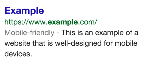
To facilitate user navigation, the label "Mobile-friendly”Will be matched to the search results that lead to pages optimized for browsing from smartphones and tablets.
The most significant data it concerns the overtaking of mobile traffic over computer traffic: smartphones and tablets recorded the 52% of online traffic.
How to design a Responsive website?
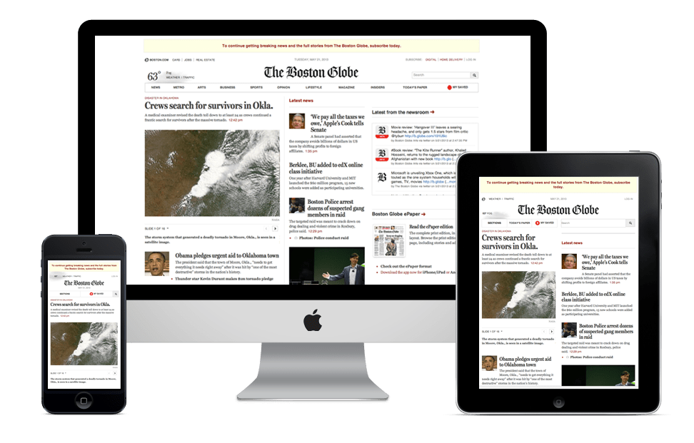 Responsive web design, for three years now, has been the best technique for designing a website precisely because, adapting to any device (regardless of the screen resolution), it takes into account all types of users.
First, it must fit most or all mobile devices, smartphones, tablets and desktops, both horizontally and vertically; it will be up to the web designer whether to consider any resolution or only some, depending on the activity, the target and the needs of the customer.
To design a Responsive site does not just mean resizing images, but designing the whole site so that users find all the information they need.
Below others fundamental elements:
- simple, usable and ideal navigation for the type of device you are using;
- simple design;
- website loading speed.
A responsive website that inspires is also a website that technically highlights a great combination of these three elements:
- fluid grid;
- fluid images;
- fluid text
If these elements are developed and designed in an optimal way and the contents (images and text) are distributed in a balanced way, the responsive website will be a great example from which to draw inspiration.
The elements not to be forgotten
 With these premises, what will have to change in the way of designing a successful website in the near future? It will certainly be essential to equip it with a responsive structure, which is suitable for viewing from mobile devices, and pages rich in text (at least 200 words) to facilitate the reading of the contents on your site.
They will not go however, the aspects that have always been valid have been neglected:
- attractive design;
- fast loading;
- intuitive navigation;
- original and quality content, reachable with no more than 3 clicks from the home page;
- frequent updates;
- a good balance between graphics, images and texts;
- tags optimized for the most important keywords;
- numerous relevant links both inbound and outbound.
Check if your site is Responsive

photo by VIKTOR HANACEK
To start to understand if your site is Responsive, it must meet at least these dimensions to be displayed:
- 320px smartphone;
- 768px tablet;
- Netbook 1024px;
- Desktop 1600px.
Check if your site is Responsive using this simple free tool, responsivepx.com, by entering the above dimensions you will understand if your site is visible on all mobile devices.


